Mano Santa
A nail studio charging studio-of-its-own prices, with every booking arriving by direct message: the diary in a notebook and the same three questions — what it includes, what it costs, when there is a slot — answered one at a time. We built a six-page site that treats each service as a piece, shows the work big, and keeps booking one click away from anywhere.
- Client
- Mano Santa
- Sector
- Nail studio
- Services
- UX/UI design, web development, art direction
- Timeline
- 5 weeks
- Tech stack
- Next.js + Tailwind + Vercel
Measurable outcomes.
+0%
More bookings, fewer questions
Every service has its own page with what it includes and its booking button, so the conversation no longer starts with the price.
0 h/wk
Less manual admin
The questions that used to repeat in every direct message — what each service includes, how long it takes, where the studio is — now live on the site.
0.6 s
The gallery shows up in half a second
Every photo is served at the exact size the screen asks for, and all six pages are built before they ship.
From the problem to the live site.
Tap each phase for the detail.
Problem diagnosis
Every booking came through a direct message, and with it the same three questions as always. The problem was never a lack of work: it was that a studio charging its own prices was presenting itself in the same format as everyone else, and the client had nowhere to see what they were buying before asking.
- Home
- Services
- Gallery
- Booking
Main heading
Headings: Cormorant Garamond
Body: Inter

- Stop the price being the first conversation
- Show the work at full size
- Book without leaving the site
Six pages, not one endless landing
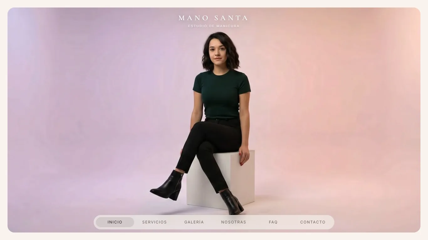
A studio with four distinct services does not fit on one page without turning it into a catalogue. Before settling on a single colour we split the content across six screens and validated what stitches them together: navigation that is always visible, marks where you are, and never sends you back to the top. On the left, the sketch; on the right, what went live.
01 / 05·Home
Editorial, warm aesthetics
A light design system on cream, with an editorial magazine serif, dusty pink as the only accent and plenty of air around every piece. The interface aims for the register of a printed publication rather than a shop, because what is being sold is a ritual and not a product. Custom components round it off: floating navigation, a letter-by-letter button and a bespoke cursor.

Six pages that open like one
All six pages are built in full before they ship, so changing section never means waiting: moving around feels like staying on a single screen. The gallery photos, which are the heaviest thing on the site, load as the visitor goes rather than all at once.
- 100Performance
- 100Accessibility
- 100Best practices
- 98SEO
- Next.js
- Tailwind CSS
- Motion
- Vercel
01 / 04·Diagnosis
«I used to spend my mornings answering prices by message. Now they arrive knowing what they want, with the time already picked.»
Your work deserves better than a direct message.
Instagram fills your diary, but it fills it badly. You can't explain what each service includes in a story, you can't show the portfolio sorted by technique, and every booking starts over with the price.
A site of your own as a nail studio solves three things at once: it presents each service with what it includes and what it costs, it shows the work with the quality that justifies that price, and it lets people book without going through a conversation. That is mornings going back to the chair.
We handle design, development and performance ourselves, with nothing subcontracted, and the site goes live in weeks rather than months.